Business Context
Care for Kids is a platform designed to help Australian parents find, compare, and secure childcare services in their local area. Users can search for services based on location, read reviews, compare fees, and even check availability, making it easier to find the best fit for their family's needs.
Challenge
The current designers and developers are fragmented and duplicated across multiple third-party design agencies, resulting in inconsistencies and inefficiencies. This disjointed approach leads to an increased workload in consolidating the designs and ensuring alignment.
Goal
To establish a centralized resource for design assets, we aim to enhance consistency through shared guidelines, enable reusability of components, and foster collaboration across teams. This approach supports scalability and maintenance of design efforts while delivering more cohesive, user-friendly solutions.
My Role
I’m the senior product designer leading this project. Throughout the process, I’ve closely collaborated with the product manager, frontend developer and coordinated with designers from third-party agencies to ensure alignment and deliverables.
Early stage - research, set metrics and build structure of design document
Middle stage - build, manage, feedback collect and make design decisions
Current stage - manage, iterate, and support on complex interactive design
I conducted a comprehensive audit of all existing design assets, including UI elements, patterns, typography, colours, icons, and layouts used across different products and teams. This included:
- Visual Audit (evaluating overall look and feel)
- Interaction Audit (assessing how assets are sourced and used)
- Accessibility Audit (ensuring compliance with accessibility standards)
Problems

🚧 Inconsistency
Without a design system, designers face challenges in maintaining consistency across design elements like colors, typography, spacing, and UI components. This leads to a fragmented and disjointed user experience that lacks cohesion and professionalism. A unified design system is essential for ensuring a seamless and consistent user experience across products.
♻️ Lack of scalability
As the platform scope increases in complexity, the lack of a design system makes it challenge to scale the design effectively. Without reusable components and established patterns, maintaining a cohesive user experience across different sections of the platform becomes difficult.
🙈 Ignore accessible design
The website design lacks proper colour contrast, making it difficult for users to distinguish between important elements such as text and background. This not only hampers readability but also accessibility for visually impaired users.
⏳ Communication issue & Time consuming
Without a shared design system as a reference point, collaboration between designers, developers, and other team members can be more challenging. Misunderstandings and discrepancies in design decisions may arise, leading to confusion and potential rework. Designing each new screen or component from scratch is time-consuming and inefficient. Designers keep on reinventing the wheel for common elements, which can slow down the design process and delay project timelines.
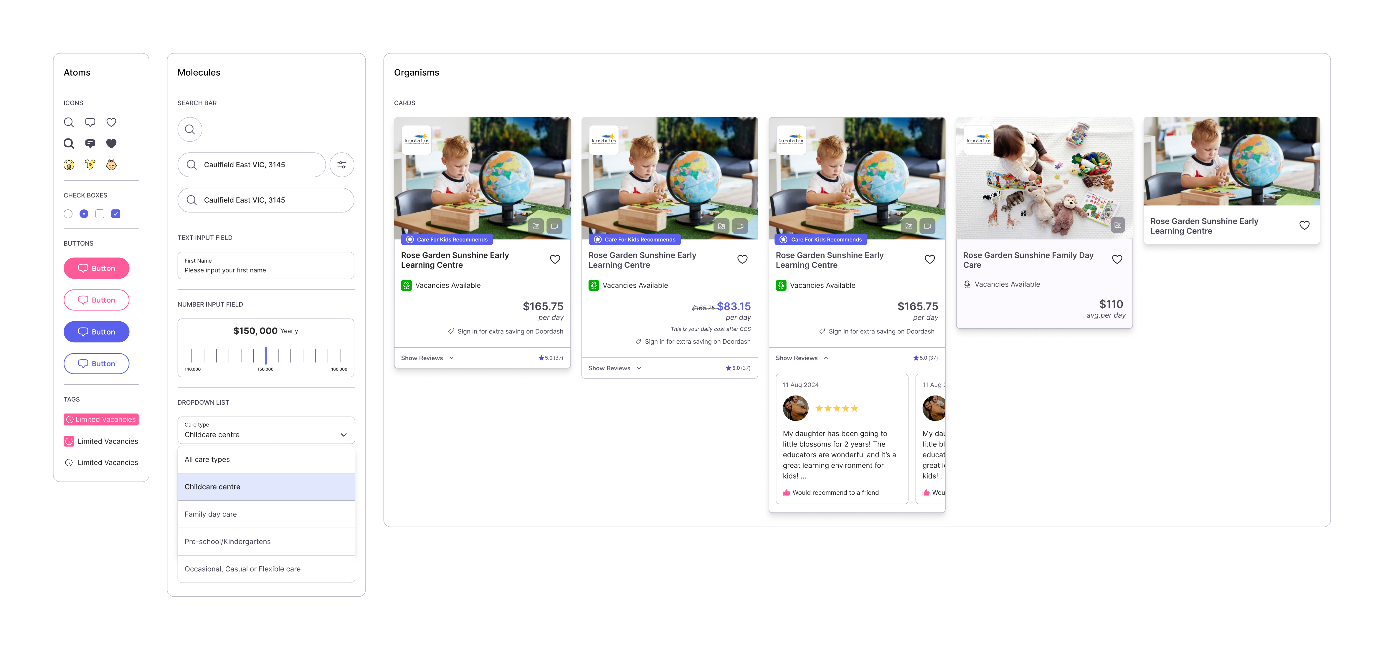
PenPal - an Atomic Design System
Step 1: How I organise design components
Atomic design is a methodology for creating consistent, scalable design systems. It was introduced by Brad Frost and breaks down user interface (UI) components into five hierarchical levels: atoms, molecules, organisms, templates, and pages.
Here's a quick peak at how I organised my components using Atomic Design principles.

Step 2: How I make this helpful for both designers and developers
Before I start creating UI elements I need to ensure I set up all the variables and definitions for the design system.
In Figma, tokens are used to manage and define design elements like colors, typography, and spacing in a centralized manner. They help ensure consistency, efficiency, and scalability in designs, while also enhancing collaboration and flexibility throughout the design process.
If you're interested in exploring how I design token system, Please check case study below:
Token System Design in FigmaIn this project I collaborate with the front-end developer, build a design system includes tokens, CSS class and code snippets directly to the Figma file.


Step 3: Simple but scalable
What helped me keep elements scalable was sticking to atomic design principles, using nested components, and using component properties to simplify variants.

Another example of nested components:

Step 4: Before & After
The design system is still in progress, and constantly being iterated on. With the new components that were implemented, has it improved the overall product? My dev team gave me some insights into what was working and what wasn’t
Here are the main pages of care for kids after applying the PenPal design system.

.png)

